Aviation Museum
At-a-Glance
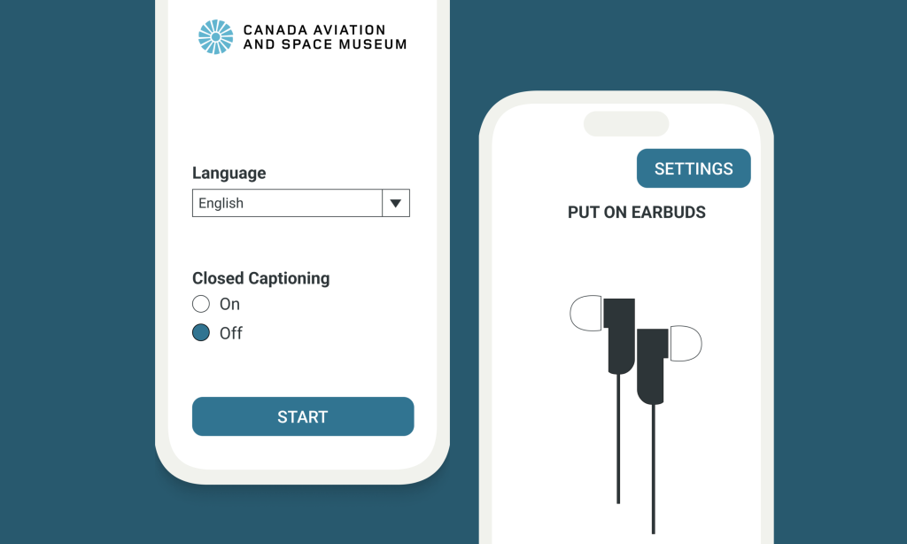
I worked in a team of three other students to create a high fidelity prototype of an AR app for a museum. I was a UI and UX designer throughout the timeline of the project. The objective was to create an easy to use and intuitive app that would be accessible to any member of the public, including those with visual and auditory impairments. The final version of the app was created in figma.
Problem
The Canadian in Space attraction at the The Canadian Aviation and Space Museum is a popular section of the museum. Unfortunately, the exhibit only features the artifacts with printed information panels. These are surprisingly low-tech solutions for a museum dedicated to innovation. These panels present accessibility and communal space challenges for the general public.
Solution
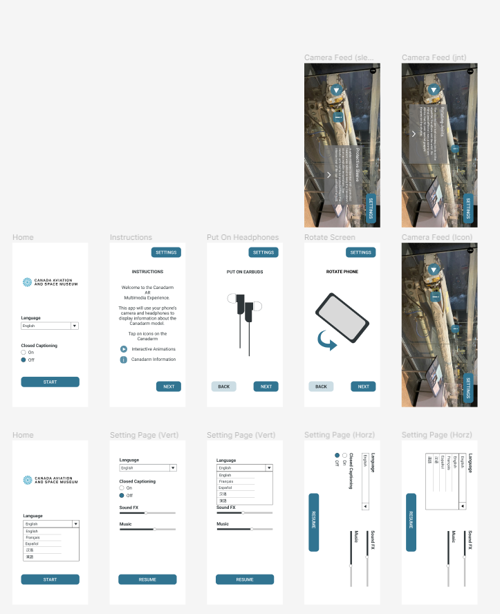
A smartphone based AR app that allows users to navigate the exhibit while reading important information about the exhibit. The user holds their phone up to the exhibit and then they have the option to watch an interactive animation or read information related to the exhibit. The app is clear and easy to use, making it accessible to as many members of the public as possible.
Sketches
We began the process by sketching out our initial ideas for the AR app. We then moved to a low fidelity prototype and then a high fidelity prototype. The sketch includes our most ambitious AR ideas. We then simplify the app in our later versions.

Low Fidelity Prototype
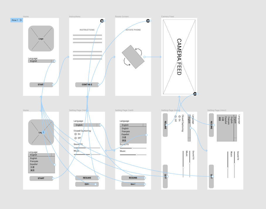
After sketching our idea, we took the design into figma to create our first version of the app and collected feedback from our potential users.
Design Iterations
We based our revisions on walkthroughs that we had our users do.
- Put the closed caption selection on the main page to serve those with hearing impairments immediately without having to go to the settings
- Changed the gear icon to a settings button as the symbol may not be as intuitive to infrequent smartphone users
- Modified the instruction layout slightly to indicated what the user would be doing a bit more clearly
- Removed the quit button as users would likely be more used to just pressing the home button on their device
- Adjusted the position of the resume button with the lack of a quit button
High-Fidelity Prototype
5 Bay Learning
At-a-Glance
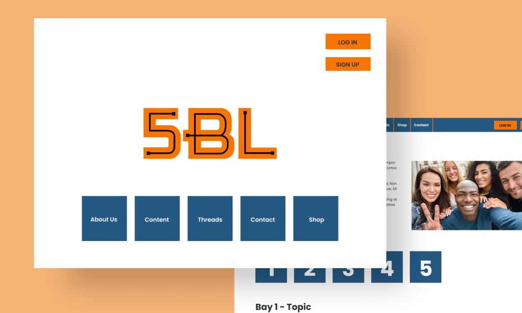
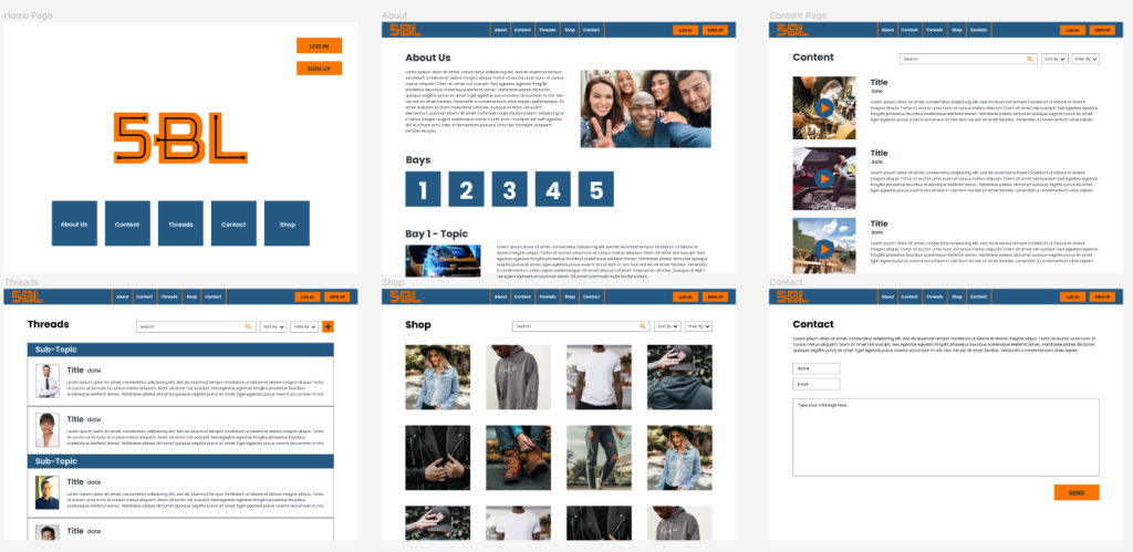
I worked with an educational company called 5 Bay Learning, as part of a group project. I was a UI designer for over the four months the project took place. The objective of the company was to create and share educational videos for users interested in specialized occupations such as welding, carpentry, and automotives. We were given the objective of creating a mock-up in adobe illustrator. After several months, I decided to revisit the project and recreate it in Figma.
Problem
5BL is a new business that needs a way for users to interact and build a community amongst themselves. The users should feel incentivized to discuss questions related to the educational content posted. YouTube is insufficient for the needs of the business.
Solution
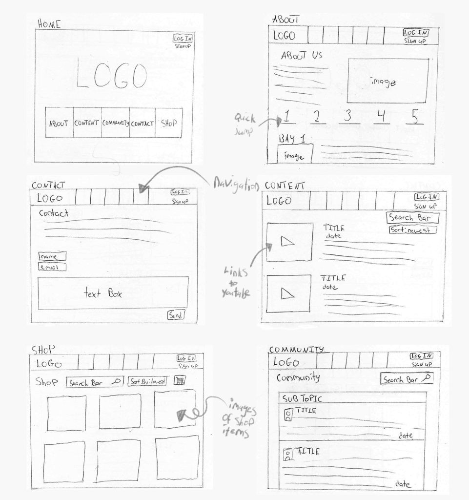
A website that features a page for community members to interact on. Videos will be posted on the website and be linked to YouTube. Users will be encouraged to use the community or “threads” page. The website will also include information about the business and a merchandise page.
Logo

Sketches
Final Version
Animal Rescue
At-a-Glance
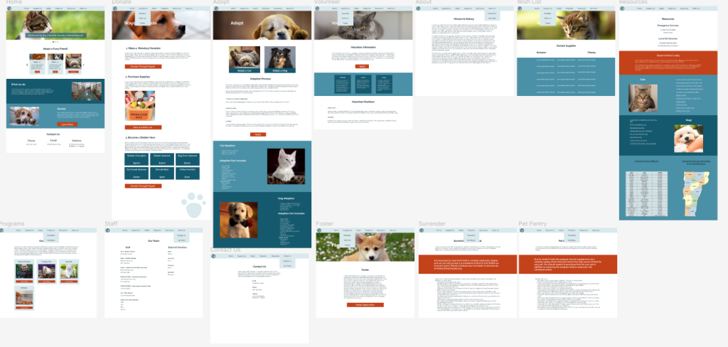
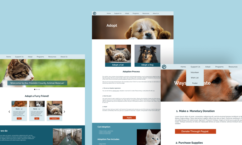
I worked with an animal shelter to help them redesign their website. The objective was to create an easier and more intuitive website, so users of all ages could navigate it better. The only constraint I had was to keep the same information. The final version of the website was created in Figma.
Problem
The animal shelter needs a website that has all the information that users need, while still be easily scannable. Their current website is confusing for older users or users that are in a rush looking for important information.
Solution
A website with all of their current information, but reorganized. I slightly changed their color theme to make information easier to read and more aesthetically pleasing.
Final Version
